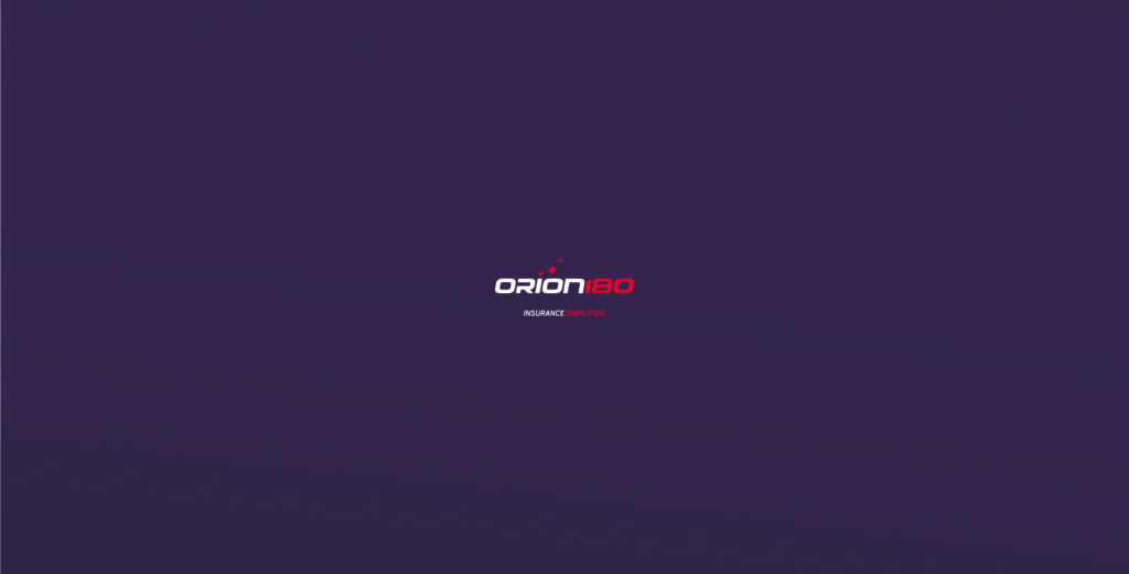
Orion180 set out to redefine insurance through technology, compassion, and innovation. I led one of my first major U.S. brand transformations: a full identity relaunch designed to feel modern, credible, and unmistakably human across every touchpoint.
Description & Defining
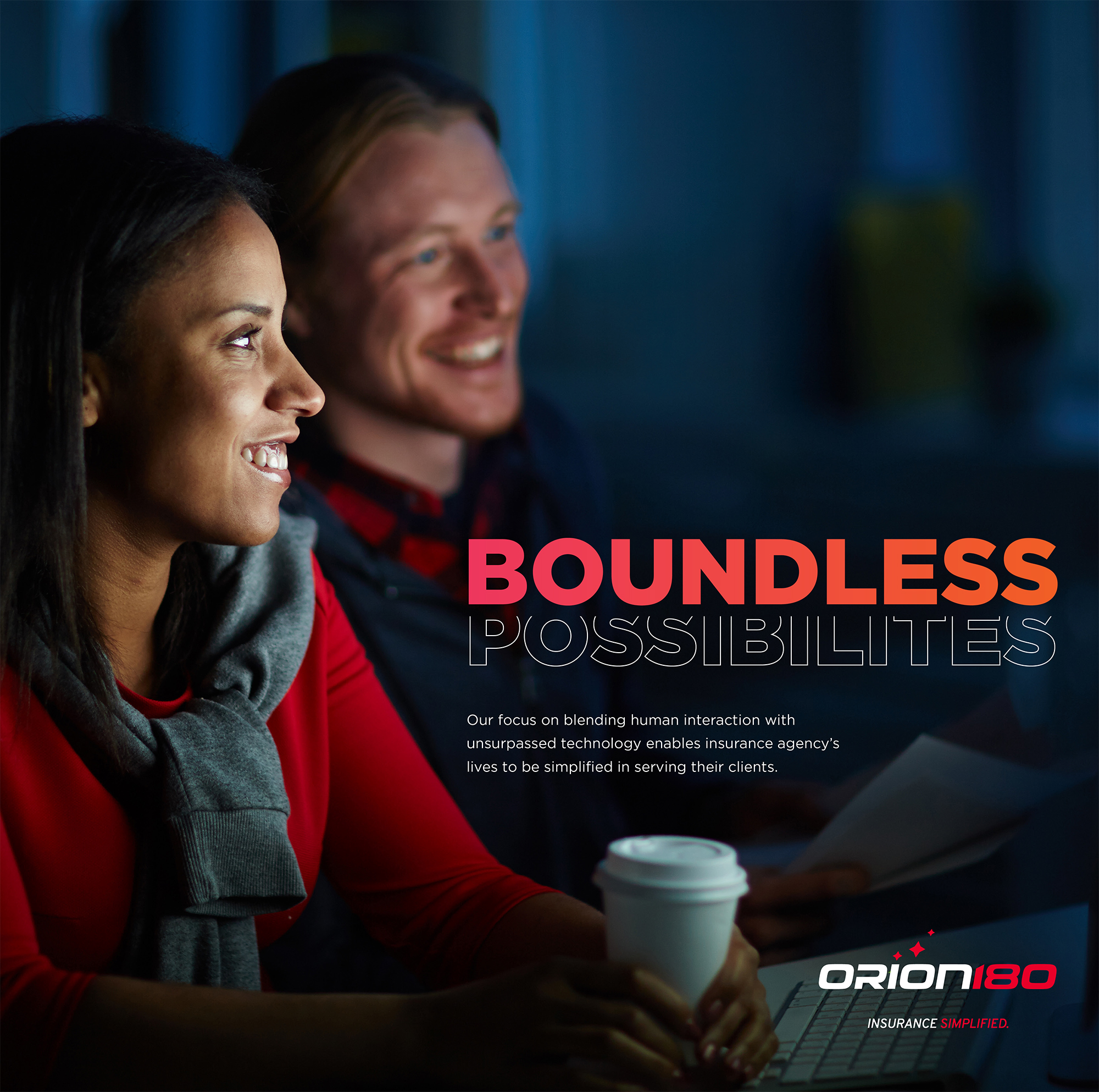
Orion180 was growing fast, but its brand presence didn’t reflect the company’s promise: insurance powered by tech, guided by compassion, and built around people. The opportunity wasn’t a “refresh,” it was a relaunch. We rebuilt the visual system from the ground up to communicate trust, clarity, and momentum, while softening the category’s typical cold, corporate tone.
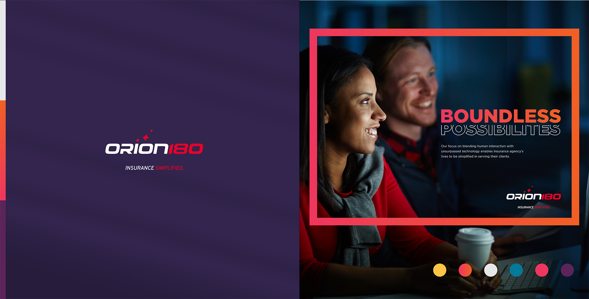
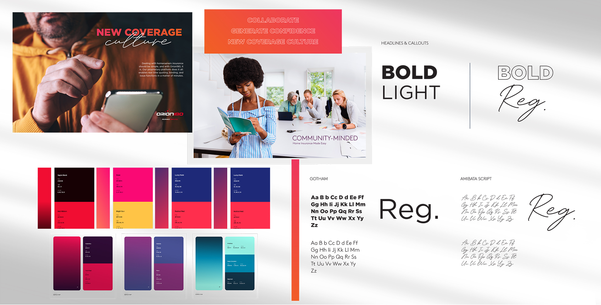
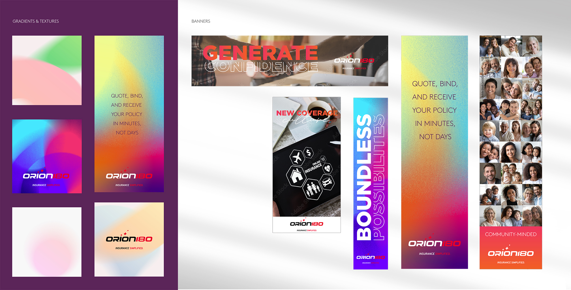
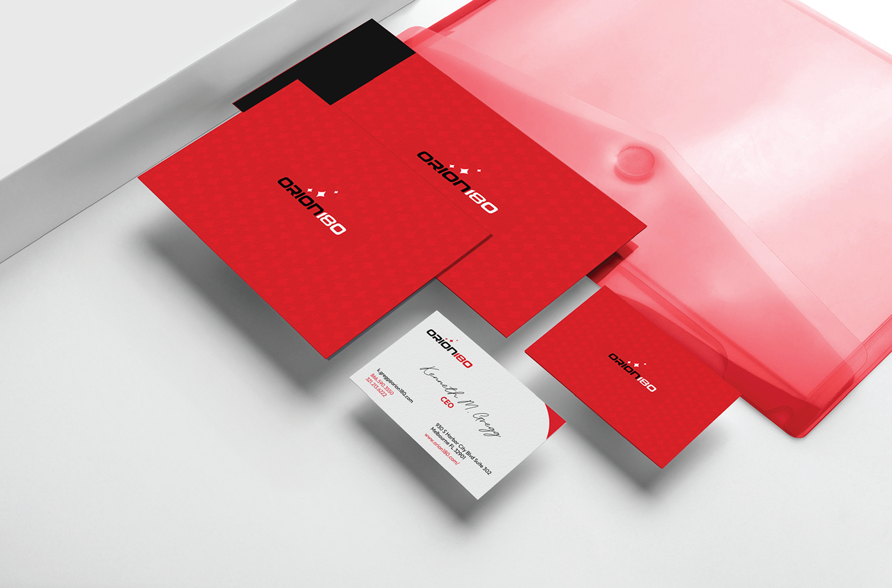
The redesign began with a new logo and a refined identity system designed to work in real-world contexts, digital, print, and sales environments, without losing consistency. From typography and color strategy to layout rules and brand hierarchy, every element was developed to improve readability, confidence, and recognition.
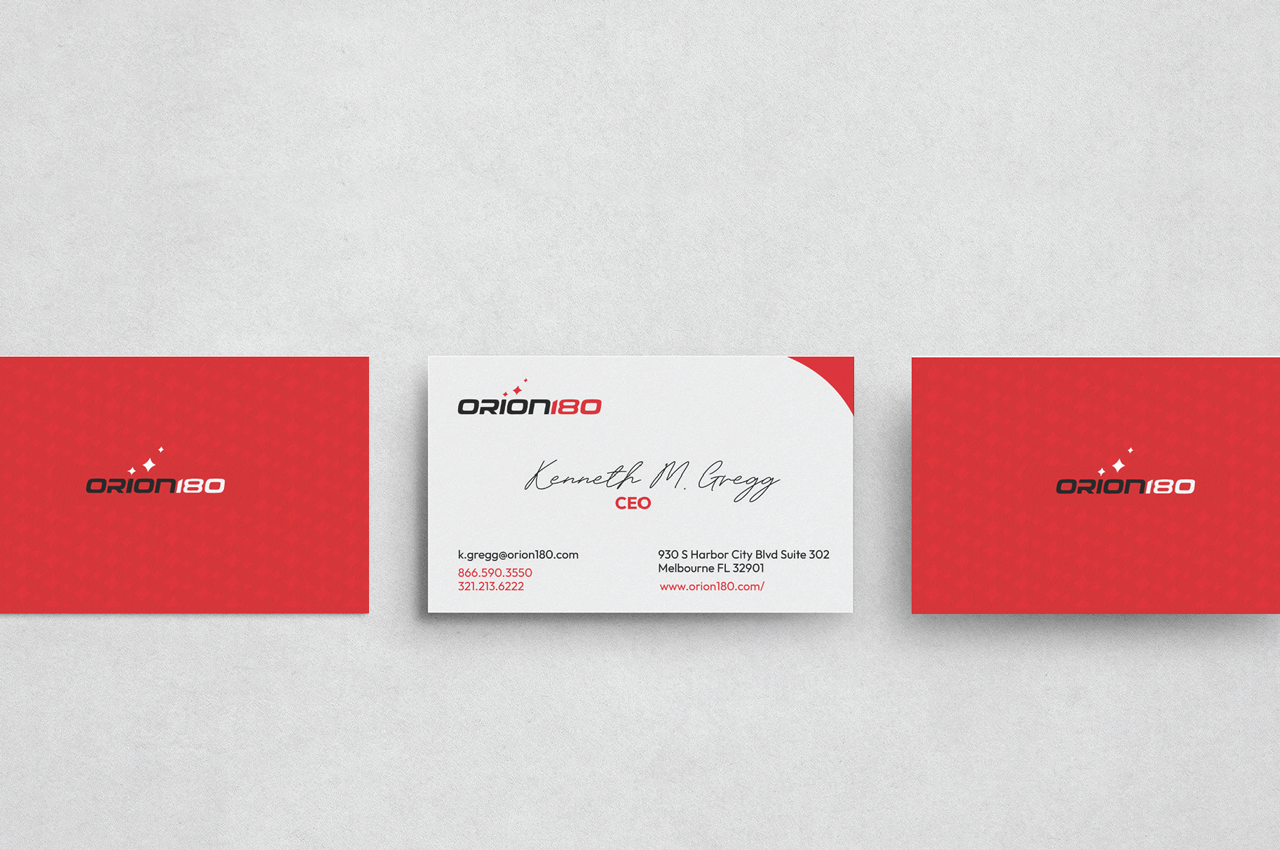
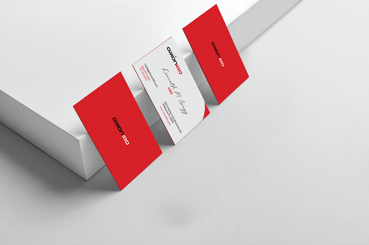
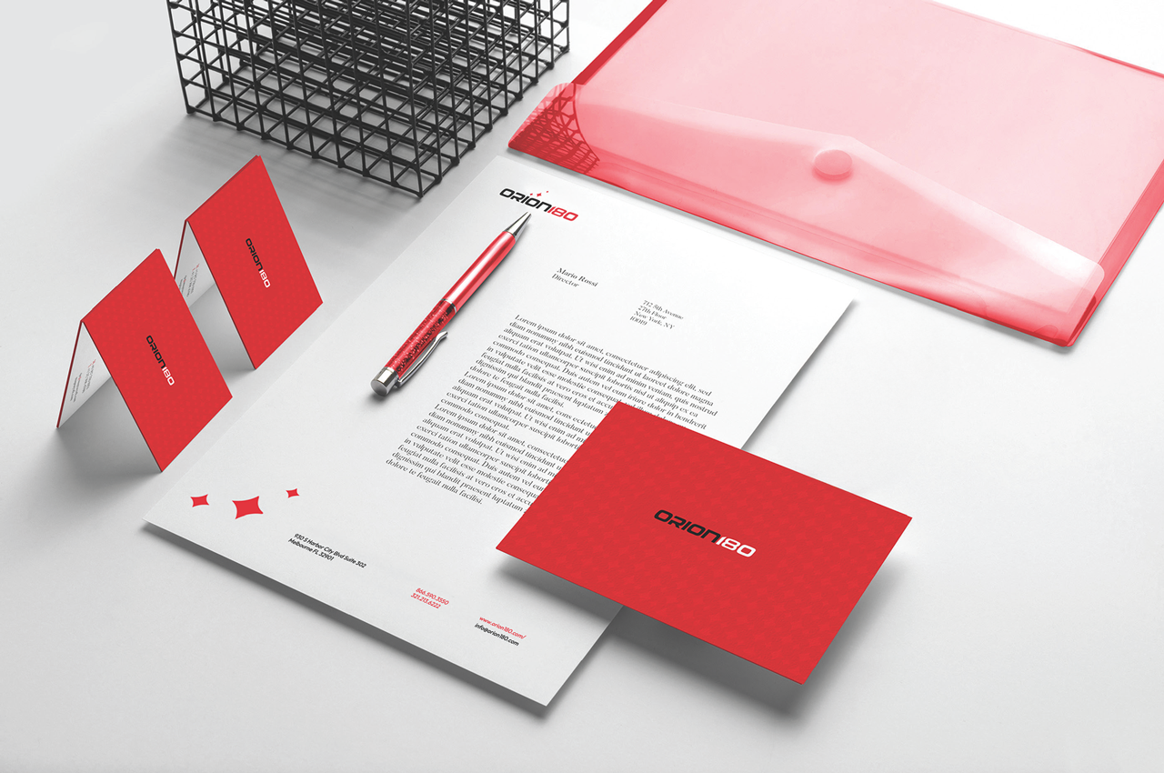
Beyond the core identity, the work extended into a sleek, user-friendly website that elevated the digital experience, plus a full refresh of stationery and promotional materials to ensure the brand felt cohesive across every interaction. The result was a future-ready brand presence that aligned with Orion180’s forward-thinking mission, while feeling more approachable, human, and emotionally intelligent.
Modernize an insurance brand without losing warmth—make it feel tech-forward and human, credible and approachable.”
The Challenge
Insurance brands often default to sterile visuals and generic messaging. Orion180 needed a system that could communicate innovation and authority while also expressing care and empathy—two ideas that rarely coexist in the category. On top of that, the brand had to scale across proposals, presentations, web experiences, and marketing materials without fragmenting.
The solutions
We didn’t just modernize the brand, we made it feel human, scalable, and built for trust.”
1) A relaunch-ready identity system
Built a cohesive visual language designed for scale (print + digital).
Established clear hierarchy rules for headlines, body copy, and data-heavy layouts.
Designed brand elements to feel confident and modern without feeling “cold.”
2) A more human brand tone (without losing trust signals)
Crafted an identity that feels less “corporate insurance,” more “people-first innovation.”
Ensured the brand could speak with clarity under pressure (customer-facing + sales-facing).
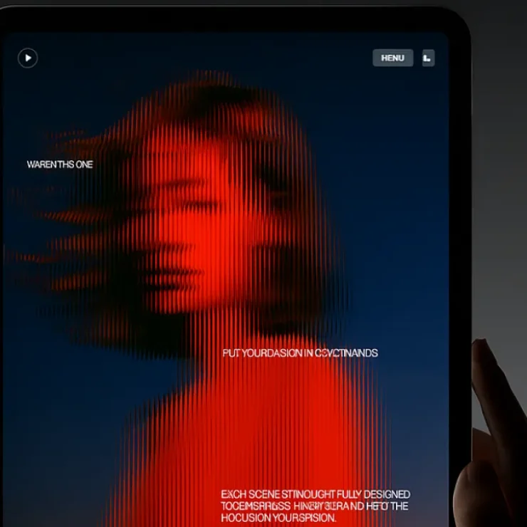
3) Website experience redesign
Elevated the digital presence with a more intuitive, user-friendly structure.
Improved visual consistency between brand and product experience.
Built a foundation that could evolve with the company’s growth and offerings.
4) Full-touchpoint consistency (the missing piece in most redesigns)
Refreshed stationery and promotional collateral so the brand didn’t “split” between web and print.
Developed reusable templates and components for internal teams to maintain quality over time.
Ensured final outputs were production-ready and easy to extend.
Outcome
A cohesive, modern identity that communicates trust and innovation—while adding the warmth and humanity Orion180 needed to stand apart in a visually repetitive category.