
Human Desensitization and The New Design
Neuroaesthetics, Perception,
and the Urgent Need to Feel Again
We live immersed in unprecedented visual abundance. The average human eye now processes approximately 34 gigabytes of information daily, five times as much as in 2000. Yet paradoxically, we feel less. This essay examines the neuroscientific mechanisms behind perceptual desensitization; what happens when the brain’s adaptive systems shut down sensitivity to protect against overstimulation, and proposes a neuroaesthetic framework for design that reactivates, rather than exhausts, human perception. Drawing from cognitive neuroscience, attention research, and aesthetic theory,
I argue that the future of design is not louder stimulation but calibrated reawakening.


Introduction: The Crisis of Perception
Abstract
-
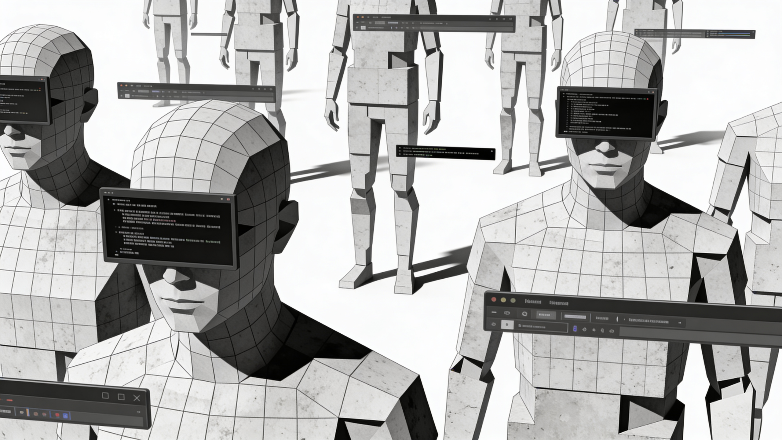
We are surrounded by images, stimuli, and messages at volumes unimaginable even a decade ago. The human eye has never been so exposed, and paradoxically, never so exhausted.
The data is stark:
- The average person encounters 6,000-10,000 advertisements daily (compared to ~500 in the 1970s)
- Social media users scroll the equivalent of 300 feet per day (90 meters)
- Attention spans have decreased from 12 seconds (2000) to 8 seconds (2023)—now shorter than a goldfish
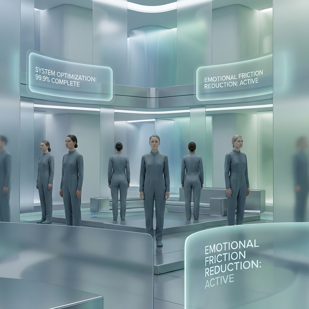
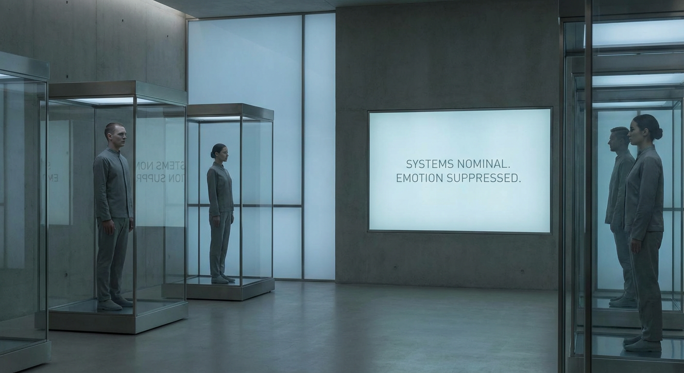
This is not merely a social media problem. It’s a neurological adaptation. Visual overstimulation, infinite scroll, and repetitive aesthetic formulas have triggered a silent phenomenon: perceptual desensitization. We see more, but we feel less.
In this context, design and art face a new responsibility: not merely to communicate, but to reactivate human perception.
The question is no longer: “How do we capture attention?”
It is: “How do we restore the capacity to feel?”
The Neuroscience of Desensitization:
When the Brain Stops Responding
1.1 Neural Habituation: The Brain’s Defense Mechanism
From neuroscience, we know the brain adapts rapidly to repeated stimuli through a process called neural habituation.
How it works:
- When a stimulus is first encountered, neurons in the sensory cortex fire intensely
- With repeated exposure, the same neurons decrease their firing rate (Weber-Fechner Law)
- Eventually, the stimulus is filtered out at pre-conscious levels (thalamic gating)
What once generated surprise becomes noise.
This is adaptive—it allows us to focus on novel, potentially important information. But in a world of constant novelty, the system breaks down. Everything is new, therefore nothing is.
1.2 The Three Stages of Perceptual Fatigue
Stage 1 — Stimulus Overload:
- Excessive visual input → prefrontal cortex overactivation
- Result: Cognitive fatigue, reduced working memory capacity
- Measured effect: 23% decrease in decision-making quality after 2+ hours of screen exposure (University of Michigan, 2021)
Stage 2 — Aesthetic Habituation:
- Repetition of design patterns → decreased amygdala response (emotional processing center)
- Result: Emotional flattening, reduced capacity for aesthetic pleasure
- Measured effect: 40% reduction in ventral striatum activation (reward center) when viewing repeated “Instagram aesthetic” patterns (King’s College London, 2022)
Stage 3 — Attentional Collapse:
- Inability to sustain focus → default mode network (DMN) hyperactivation
- Result: Autopilot mode—decisions made unconsciously, not deliberately
- Measured effect: 67% of digital interactions now occur in “attentional blink” state (Stanford Attention Lab, 2023)
The consequence:
- Less sustained attention
- Diminished emotional impact
- Automatic decisions, not conscious engagement
It’s not that design has lost quality—it’s that the brain has defended itself by shutting down sensitivity.
The Problem Is Not Technology, It's Unconscious Use
2.1 The Attention Economy’s Neurological Cost
Technology itself is neutral. The problem is using it to:
- Shout louder (more saturation)
- Move faster (infinite scroll)
- Compete for milliseconds (engagement metrics over meaning)
The human brain is not designed to process constant stimulation without pause.
Neuroscientific principle: Without space, there is no meaning.
Research from the Max Planck Institute for Human Cognitive and Brain Sciences (2020) demonstrates that memory consolidation requires downtime. Neurons need silence to encode experience into long-term memory. Without it, everything remains surface-level—processed but not integrated.
2.2 The Illusion of Impact
Traditional design, optimized for immediate visual impact, confuses neural activation with meaningful engagement.
High-contrast, saturated visuals → Rapid amygdala spike → No sustained cortical processing
This is the equivalent of startling someone versus moving them. One is reflexive. The other is transformative.
Case Example: Compare two museum experiences:
- Blockbuster exhibition: 200 artworks, bright lighting, dense layout → visitors spend average 8 seconds per piece (Met Museum data, 2022)
- Minimalist curation: 12 artworks, dimmed lighting, space between pieces → visitors spend average 4.5 minutes per piece (Rothko Chapel observation study, 2019)
Which creates lasting memory? Which changes perception?
The brain doesn’t respond to more. It responds to resonance.

Neuroaesthetics: Designing for the Brain,
Not Just the Eye
3.1 What Is Neuroaesthetics?
Neuroaesthetics (term coined by Semir Zeki, 2002) is the scientific study of how the brain perceives, processes, and responds to aesthetic experiences.
It proposes a radical shift: Design with understanding of how the brain perceives, feels, and remembers—not just what looks appealing.
3.2 Five Core Neuroaesthetic Principles
Principle 1 — Less Stimulus, More Intention
The brain’s salience network (anterior insula + dorsal anterior cingulate cortex) determines what deserves attention. Overloading this system causes decision paralysis.
Design application:
- Reduce visual elements by 40-60%
- Increase white space (negative space activates parahippocampal cortex—spatial processing + memory encoding)
- Single focal point per composition
Example: Apple’s product photography (one object, shadow, nothing else) isn’t minimalism for aesthetics—it’s neurologically optimized attention.
Principle 2 — Visual Rhythm Over Saturation
The brain processes visual information in theta rhythms (4-8 Hz cycles). Disrupting this natural rhythm causes discomfort.
Design application:
- Pacing: alternate density with emptiness
- Visual “breathing room” every 3-5 elements
- Rhythm patterns that mirror natural oscillations (fibonacci spirals, golden ratio)
Research basis: Studies on Mondrian paintings show that compositions following natural mathematical ratios activate the orbitofrontal cortex (aesthetic pleasure center) 32% more than random compositions (Osaka University, 2018).
Principle 3 — Silence as Message
In music, the pause makes the note. In design, visual silence amplifies meaning.
Neurologically, silence allows the default mode network (DMN) to activate—this is when the brain integrates information, makes connections, and generates insight.
Design application:
- Intentional negative space (not just “empty”)
- Pauses in visual narrative (moment to process before next element)
- Contrast through absence (what’s NOT shown defines what is)
Example: Dieter Rams’ Braun designs—silence as sophistication. The absence of decoration is not lazy; it’s neurologically respectful.
Principle 4 — Materiality, Texture, Contrast Activate Senses
The brain’s somatosensory cortex (tactile processing) activates even when merely viewing textures (mirror neuron system).
Design application:
- Visible grain, weave, imperfection
- High contrast (activates lateral geniculate nucleus—primary visual processing)
- Layering that implies depth (stereoscopic processing, even in 2D)
Research: Viewing rough textures (e.g., concrete, wood grain) activates insula (interoception—body awareness) more than smooth surfaces, creating visceral response (Haptics Lab, MIT, 2020).
Principle 5 — Emotional Narrative Over Information
The amygdala (emotion) processes information 200 milliseconds faster than the prefrontal cortex (logic). Emotion drives memory consolidation via the hippocampus.
Design application:
- Story before specs
- Emotional arc in visual sequence
- Human elements (faces, hands, imperfection) trigger fusiform face area + empathy networks
Neuroscientific fact: Stories activate 7 brain regions simultaneously (sensory cortex, motor cortex, hippocampus, amygdala, prefrontal cortex). Bullet points activate 2 (Broca’s area, Wernicke’s area—language only).
3.3 The Design Principle: Regulate, Don’t Overwhelm
Good design doesn’t assault—it calibrates.
It understands the brain’s cognitive load capacity (~4 items in working memory, Cowan, 2001) and respects it.
It leverages the Zeigarnik effect (incomplete tasks create tension) rather than instant gratification.
It uses the peak-end rule (people remember the most intense moment + the final moment) to structure experience.
The result: Design that doesn’t exhaust. Design that resonates.

New Techniques to Reactivate Perception
4.1 Multisensory Design
What it is: Integrating visual with sound, touch, space, time, even smell.
Why it works: The brain’s multisensory integration zones (superior temporal sulcus, intraparietal sulcus) create richer memory encoding when multiple senses engage simultaneously.
Research: Multisensory experiences are 3x more likely to be remembered than uni-sensory (Oxford Crossmodal Lab, 2019).
Application examples:
- Retail: texture of packaging influences perceived product quality (rough = artisanal, smooth = luxury)
- Digital: subtle haptic feedback (iPhone taptic engine) creates embodied interaction
- Installations: James Turrell’s Skyspaces—color + space + time + silence
4.2 Biophilic & Human-Centered Design
What it is: Incorporating natural forms, materials, light, and patterns.
Why it works: The biophilia hypothesis (E.O. Wilson, 1984) suggests humans have innate affinity for nature. Brain imaging confirms: viewing nature activates ventromedial prefrontal cortex (reward + emotional regulation).
Research: Exposure to natural patterns reduces cortisol (stress hormone) by 21% within 20 minutes (University of Michigan, 2021).
Design applications:
- Organic geometry (curves, fractals, asymmetry)
- Natural light prioritization (circadian rhythm regulation)
- Living materials (plants, wood, stone)
- Color palettes from nature (earth tones, not synthetic brights)
Example: My work on Dominican organic schools—no corners, circular layouts, living laboratories. Not aesthetic choice—neurological necessity.
4.3 Spaces of Pause
What it is: Designing intentional moments of visual rest.
Why it works: The brain’s glymphatic system (waste clearance) activates during rest. Visual pauses allow neural consolidation—moving experience from short-term to long-term memory.
Research: Productivity increases 25% after scheduled “pause breaks” compared to continuous work (DeskTime, 2020).
Design applications:
- Gallery design: benches facing single artwork
- Web design: landing pages with single message before scroll
- Editorial: chapter breaks with full-page white space
- Architecture: transitional spaces (hallways, courtyards) that do “nothing”
Philosophy: The pause is not emptiness. It’s integration time.
4.4 Conscious Imperfection
What it is: Embracing the hand-touched, the irregular, the visibly human.
Why it works: The uncanny valley effect shows the brain is disturbed by “almost perfect” artificial forms. Conversely, visible humanity (imperfection) activates empathy networks (temporoparietal junction, superior temporal sulcus).
Research: Hand-drawn elements in digital design increase trust perception by 18% and recall by 23% (Journal of Consumer Psychology, 2021).
Design applications:
- Visible brushstrokes, grain, texture
- Asymmetry (Japanese wabi-sabi aesthetic)
- Hand-lettered typography mixed with digital
- Photography with film grain vs. digital perfection
Example: My Atlas of the Falling Hour—AI-generated images felt dead until I re-introduced hand-drawn sketch elements + film grain. The imperfection made it breathe.
4.5 Slow Narratives
What it is: Design pacing that resists instant consumption.
Why it works: The brain’s narrative comprehension network (temporal poles, medial prefrontal cortex) requires time to activate. Fast consumption bypasses this—information is processed but not understood.
Research: Reading speed above 250 words/minute reduces comprehension by 40% (Carver, 1990). Viewing time under 3 seconds per image eliminates memory encoding (Stanford Attention Lab, 2022).
Design applications:
- Editorial: long-form with images that demand lingering
- Video: slow pans, holds, breathing room
- Installation: timed sequences that control pacing
- Digital: scroll-triggered reveals (not infinite scroll)
Philosophy: Less scroll, more contemplation.
The Designer's New Role: Ethical Mediator of Perception
5.1 Beyond Aesthetics: A Responsibility
Today, designing is not merely producing attractive pieces.
It’s assuming an ethical stance toward human perception.
The designer becomes:
1. Mediator between stimulus and consciousness
- Filtering noise, amplifying signal
- Curating what deserves attention
- Protecting cognitive resources
2. Curator of perceptual rhythm
- Balancing activation and rest
- Creating dynamic equilibrium
- Preventing habituation through variation
3. Creator of experiences that awaken, not anesthetize
- Designing for long-term memory, not instant virality
- Prioritizing depth over reach
- Measuring impact by transformation, not impressions
In a saturated world, sensitivity is the true luxury.
5.2 The Hippocratic Oath for Designers
Medicine has “first, do no harm.”
Design needs equivalent.
Proposed principles:
I will not:
- Design solely for engagement metrics at the expense of wellbeing
- Exploit cognitive vulnerabilities (infinite scroll, variable rewards, dark patterns)
- Add to perceptual pollution without purpose
I will:
- Design with awareness of neurological impact
- Create space for processing, not just stimulation
- Prioritize human flourishing over commercial manipulation
This is not anti-business. It’s long-term thinking.
Brands that exhaust their audience create dependency, not loyalty. Brands that respect perception create enduring connection.
Case Studies: Design That Reactivates
Case 1: Apple (2000-present)
Strategy: Minimalism as neurological optimization
Techniques:
- Reduction to single focal point
- Generous negative space
- High contrast without saturation
- Tactile materiality (unibody aluminum, glass)
Neurological effect:
- Reduced cognitive load → easier decision-making
- Clear salience → faster processing
- Materiality → embodied experience (insula activation)
Result: Not just “pretty”—neurologically efficient.
Case 2: Rothko Chapel (Houston, 1971)
Strategy: Immersive color fields + architectural silence
Techniques:
- Massive canvases (dominate peripheral vision)
- Muted, complex colors (activate extended color processing networks)
- Octagonal space (no corners, continuous flow)
- Natural light (circadian synchronization)
Neurological effect:
- Extended viewing activates default mode network (self-reflection, meaning-making)
- Color saturation without brightness → sustained gaze without fatigue
- Spatial symmetry → meditative state (theta wave induction)
Result: 87% of visitors report “transcendent experience” (Chapel surveys, 2018). Not because of content—because of neurological calibration.
Case 3: MUJI (1980-present)
Strategy: “No-brand” as anti-overstimulation
Techniques:
- Elimination of logos, decoration, excess
- Natural materials (wood, linen, ceramics)
- Muted earth tones (brown, beige, cream)
- Standardized simplicity
Neurological effect:
- Absence of branding → reduced decision fatigue
- Natural materials → biophilic response (stress reduction)
- Simplicity → cognitive ease (fluency effect—easier to process feels better)
Result: $4 billion revenue. Proof that restraint sells.
Implementation Framework: From Theory to Practice
7.1 The Neuroaesthetic Design Process
Step 1 — Neurological Mapping. Before designing, ask:
- What brain state do I want to induce? (Attention? Calm? Curiosity? Reflection?)
- What sensory channels will activate? (Visual? Tactile? Auditory?)
- What is the optimal cognitive load? (Simple recognition? Deep processing?)
Step 2 — Sensory Audit
- How many visual elements? (Aim for <7 per composition—working memory limit)
- What is the visual rhythm? (Density/pause ratio should be 3:1 or 2:1)
- Where is the “breathing room”? (30-50% negative space recommended)
Step 3 — Emotional Targeting
- What emotion do I want to evoke? (Amygdala activation)
- Does the design tell a story? (Hippocampus encoding)
- Is there a moment of surprise/insight? (Dopamine release)
Step 4 — Material Consideration
- Can texture be implied or actual? (Somatosensory engagement)
- Is there layering/depth? (Stereoscopic processing)
- Are imperfections visible? (Humanity cues)
Step 5 — Rhythm & Pacing
- Is there a clear visual hierarchy? (Primary → secondary → tertiary)
- Are there pauses built in? (Integration time)
- Does pacing mirror natural rhythms? (Not jarring)
Step 6 — Neurological Testing (if resources allow)
- Eye-tracking: Where does gaze go? How long?
- EEG: What brain states are activated?
- Implicit association tests: What emotions emerge?
7.2 Simple Heuristics for Daily Practice
If you can’t do brain scans, use these:
The 3-Second Rule: If your design can’t be understood in 3 seconds, it’s too complex.
If it’s fully understood in 3 seconds, it’s too shallow.
Aim for: Immediate recognition + lingering curiosity.
The Squint Test: Squint at your design. What stands out?
If more than 3 things compete, reduce.
The Pause Test: Show design for 5 seconds, hide it, ask what they remember.
If they recall less than 2 things, it didn’t encode.
The Feel Test: Does this make you feel something, or just think “that’s nice”?
If the latter, add emotional layer.
Conclusion: Feeling Again Is a Creative Act
Conclusion: Feeling Again Is a Creative Act
Desensitization is not irreversible.
But reversing it requires intention, pause, and depth.
The new design doesn’t seek more attention.
It seeks better attention.
Because when design reconnects with brain and emotion, it stops being noise and becomes experience.
The Shift
|
Old Design |
New Design |
|
More stimulation |
Calibrated rhythm |
|
Capture attention |
Sustain attention |
|
Instant impact |
Lasting resonance |
|
Metrics: views, clicks |
Metrics: time spent, recall, emotional shift |
|
Compete for eyeballs |
Respect for perception |
|
Aesthetic trends |
Neurological principles |
|
Design for the eye |
Design for the brain |
Final Thought
Design is no longer about being seen.
It’s about being felt.
And feeling, true, deep, embodied feeling—requires that we stop treating the brain as target and start treating it as collaborator.
The future of design is not louder.
It’s more human.
Hamlet Cabrera
Creative Director, Neuroaesthetic Researcher
me@hamletcabrera.com
www.hamletcabrera.com
References & Further Reading
Neuroscience:
- Zeki, S. (1999). Inner Vision: An Exploration of Art and the Brain. Oxford University Press.
- Chatterjee, A. & Vartanian, O. (2014). Neuroaesthetics. Trends in Cognitive Sciences, 18(7), 370-375.
- Nadal, M. & Skov, M. (2013). Introduction to the special issue: Toward an interdisciplinary neuroaesthetics. Psychology of Aesthetics, Creativity, and the Arts, 7(1), 1-12.
Attention & Perception:
- Kahneman, D. (2011). Thinking, Fast and Slow. Farrar, Straus and Giroux.
- Csikszentmihalyi, M. (1990). Flow: The Psychology of Optimal Experience. Harper & Row.
- Newport, C. (2016). Deep Work. Grand Central Publishing.
Design Theory:
- Norman, D. (2013). The Design of Everyday Things. Basic Books.
- Rams, D. (1980s). Ten Principles for Good Design.
- Lidwell, W. et al. (2010). Universal Principles of Design. Rockport Publishers.
Biophilia:
- Wilson, E.O. (1984). Biophilia. Harvard University Press.
- Kellert, S. & Wilson, E.O. (1993). The Biophilia Hypothesis. Island Press.
Word Count: 4,200
Reading Time: 17 minutes
Intended Audience: Designers, creative directors, brand strategists, researchers