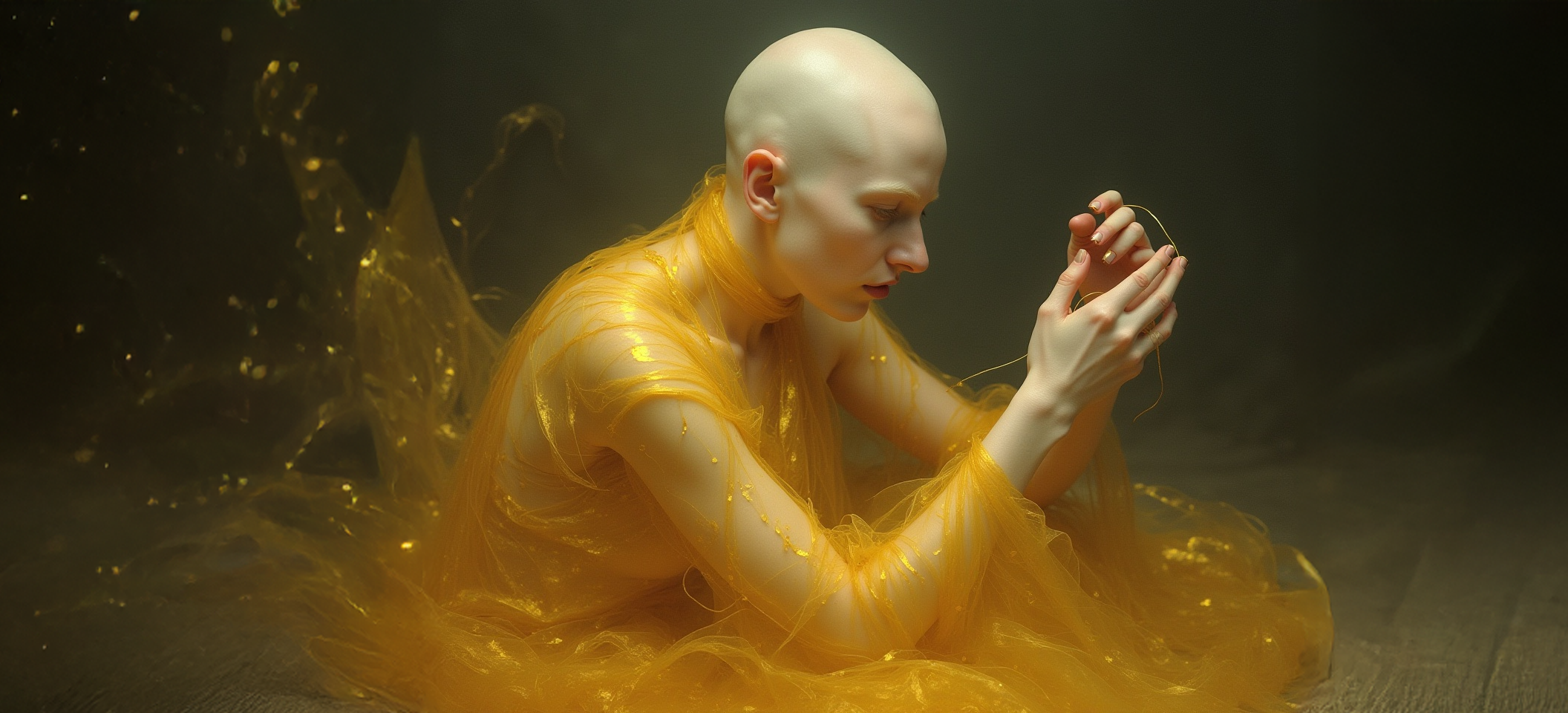
Atlas of the Falling Hour (What Belongs to No One)
Art should tremble.
In an age where AI can generate anything, the question is no longer “can machines create?” It’s “can they help us see what we couldn’t see before?”
This book is not about AI replacing the artist. It’s about AI as an archaeological tool, excavating images buried in language, translating philosophy into flesh, making the abstract visceral. Between Glass and Sand (published as Atlas of the Falling Hour) is a meditation on time, impermanence, and the slow erosion of the self. But it’s also a technical experiment: can you direct AI like a cinematographer? Can sketches become seeds? Can philosophical concepts take physical form?
The answer: Yes. But only if you treat AI not as magic, but as collaborator that needs a brutal creative director.
This case study documents that process.
Category: Creative Direction / Art Book Production / AI-Assisted Imagery
Project Type: Independent Publication
Timeline: 8 months (Concept to Published)
Platform: Amazon KDP (Kindle Direct Publishing)
Disciplines: Creative Writing / Visual Philosophy / AI-Directed Imagery / Book Design
My Role: Author, Creative Director, Image Director, Designer, Producer
When AI Becomes the Brush: Creating Visceral Philosophy Through Hybrid Art
Since 2019, Google has used mobile-first indexing. That means Google predominantly uses the mobile version of your site for ranking and indexing — not the desktop version. So if your mobile site isn’t up to par, you’re not just affecting user experience — you’re hurting your SEO too.
CONTEXT & CHALLENGE
The Problem: Philosophy Needs a Body
-
I had written 12 philosophical prose-poems about time’s relationship to the body:
- Time as black sand falling through an hourglass
- Skin as fabric worn by years
- The self as broken threads being rewoven
- Glass as metaphor for fragility and transparency
But words alone felt insufficient. These weren’t meant to be read—they were meant to be felt.
The challenge: How do you visualize existential concepts without becoming literal or decorative?
Traditional options:
- Commission illustrators: $200-500/image × 40+ images = $8,000-20,000 (unsustainable for independent publication)
- Stock photography: Clichéd, disconnected from text’s specific vision
- Abstract design: Risk of becoming mere decoration
The Opportunity: AI as Visual Translator
What if AI could function as:
- Sketch interpreter — translating rough hand drawings into refined imagery
- Conceptual visualizer — embodying abstract philosophy in physical form
- Style synthesizer — maintaining visual coherence across 40+ images
Strategic Insight:
AI doesn’t create from nothing—it needs rigorous creative direction. The artist’s role shifts from executor to visionary conductor: you provide the sketch, the concept, the constraints—AI provides possibilities you refine into truth.
STRATEGIC APPROACH
PHASE 01 — Conceptual Architecture
Before touching AI, I established the visual language:
Core Visual Metaphors:
- Hourglass = Body (glass skin containing time)
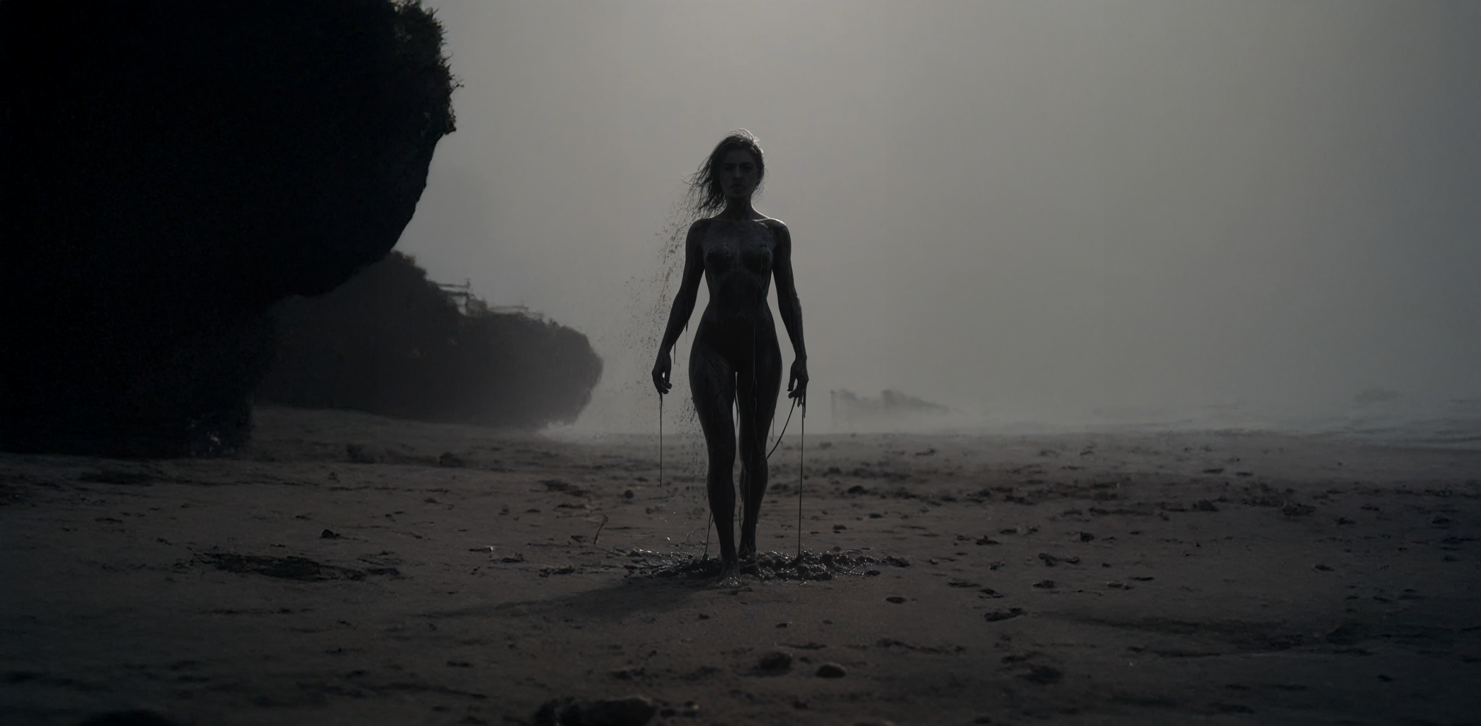
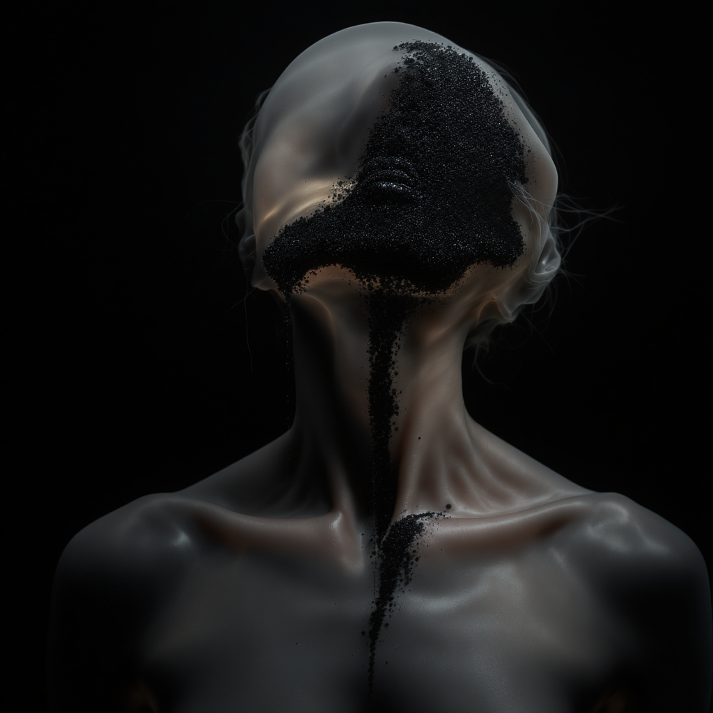
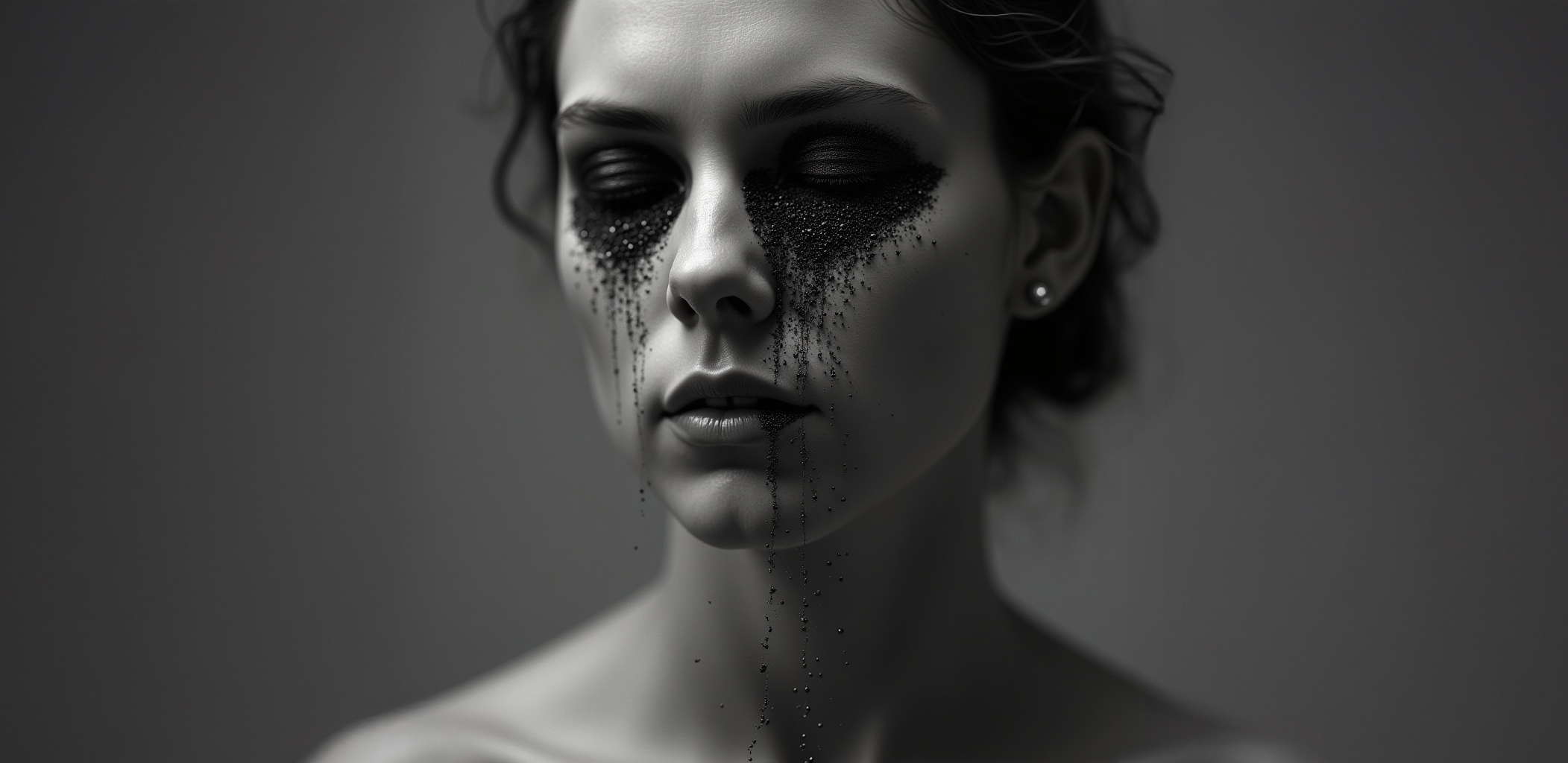
- Black sand = Time itself (falling, unstoppable, staining)
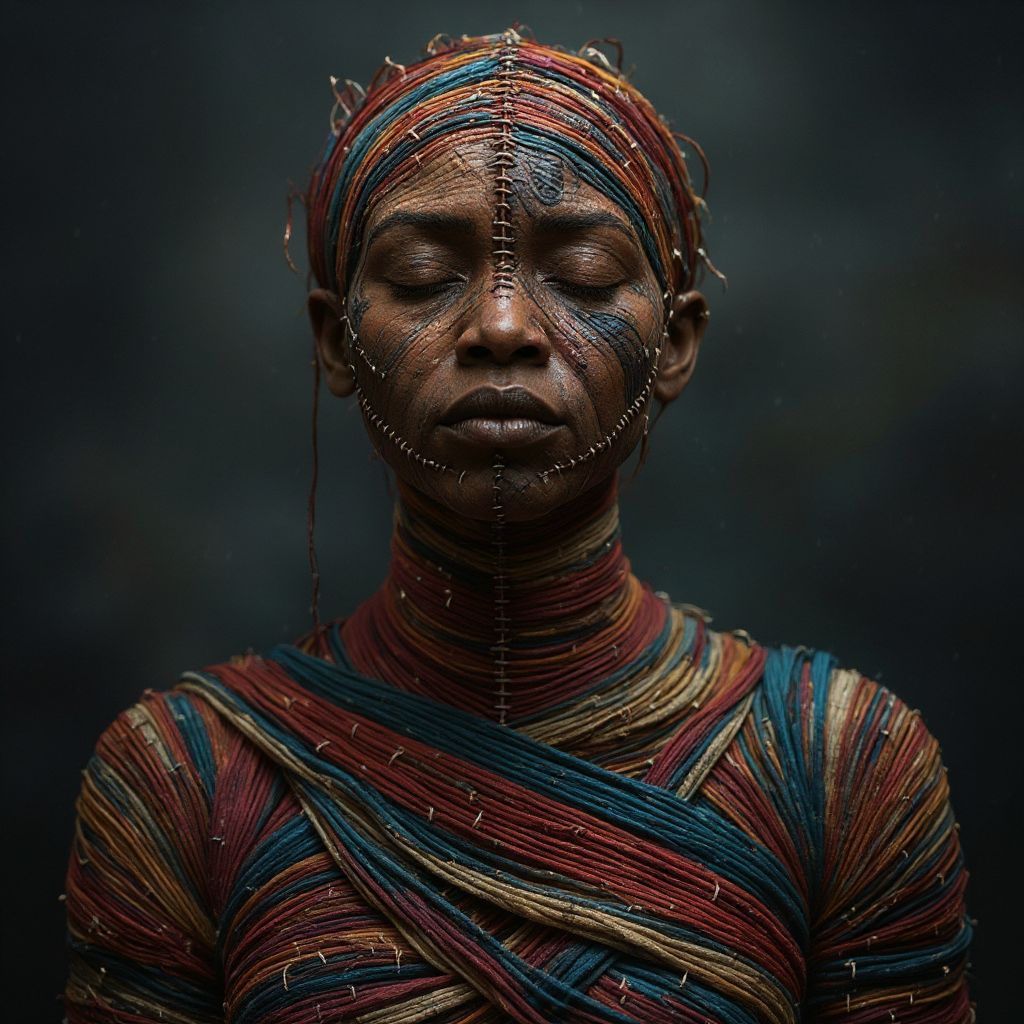
- Threads = Memory/Connection (what binds fragmented selves)
- Fabric/Skin = Identity (worn, scarred, sacred)
- Fracture/Dissolution = Transformation (not death, but metamorphosis)
Color Philosophy:
- Monochromatic dominance (blacks, grays, whites)
- Muted earth tones (ochres, siennas—erosion colors)
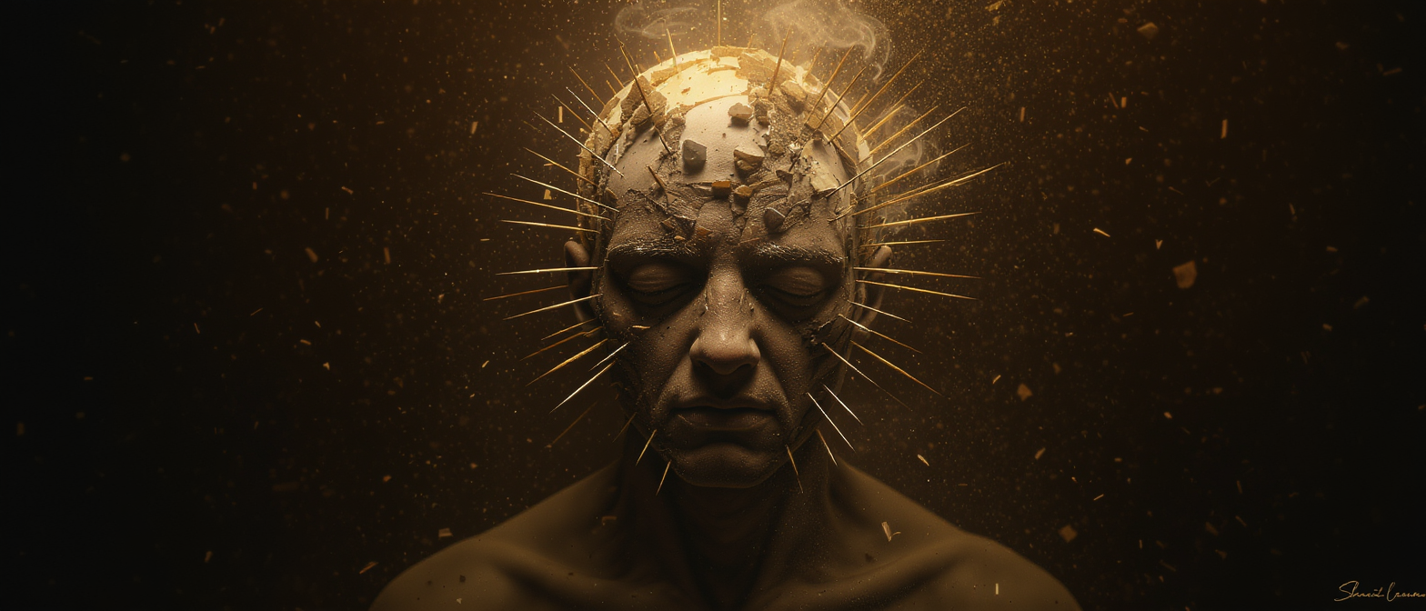
- Strategic gold accents (threads of light, redemption)
- No bright colors—this is a meditation, not celebration
Texture Vocabulary:
- Rough, organic, hand-touched (not digital-smooth)
- Grain visible (sand, fabric weave, glass imperfections)
- High contrast (shadow as sculptural element)
- Imperfection as authenticity
PHASE 02 — Hybrid Workflow Design
I developed a 5-step process for each image:
Step 1 — Conceptual Sketch (Analog)
- Rough pencil/ink drawings on paper
- Focuses on composition, gesture, emotion
- Not “beautiful”—just directionally true
- Example: Hourglass figure with sand pouring through ribcage
Step 2 — Scan & Analyze
- High-res scan (600 DPI)
- Identify strongest elements to preserve
- Note what needs AI to amplify (texture, atmosphere, detail)
Step 3 — AI Generation (Iterative)
- Platforms used: Kling AI, Venice AI, Freepik AI
- Detailed text prompts based on sketch + conceptual intent
- 20-50 variations per image
- Critical filter: Does this feel true to the philosophy, or just “cool”?
Step 4 — Curation & Selection
- Select 3-5 strongest AI outputs
- Criteria: Emotional resonance > Technical perfection
- Avoid anything that feels “stock” or generic
Step 5 — Final Retouching (Photoshop)
- Blend AI outputs if needed (composite best elements)
- Add grain, texture overlays
- Adjust tonality to match book’s palette
- Add back hand-drawn elements from original sketch if AI lost them
- Final pass: Does this image tremble?
PHASE 03 — Editorial Design as Ritual
The book design itself had to embody the philosophy:
Page as Threshold:
- Each chapter = transition space, not container
- White space = silence (essential, not empty)
- Text placement = choreographed, not justified-left
- Images bleed or float depending on emotional weight
Typography:
- Serif for body text (warmth, human touch)
- Sans-serif for titles (clarity, edges)
- Generous leading (let words breathe)
- No decoration—every element serves meaning
Chapter Structure:
- Roman numerals (timeless, classical)
- Each chapter = meditation on one metaphor
- Poems face images in dialogue, not illustration
- Pacing: slow, deliberate, contemplative
CREATIVE SOLUTION
Image Direction Philosophy: “Visceral Abstraction”
The images had to exist in a paradox:
- Abstract enough to avoid literalism
- Concrete enough to feel embodied
Example: Chapter VIII — “I Am Black Sand”
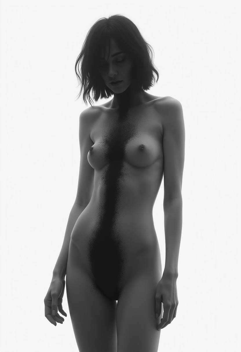
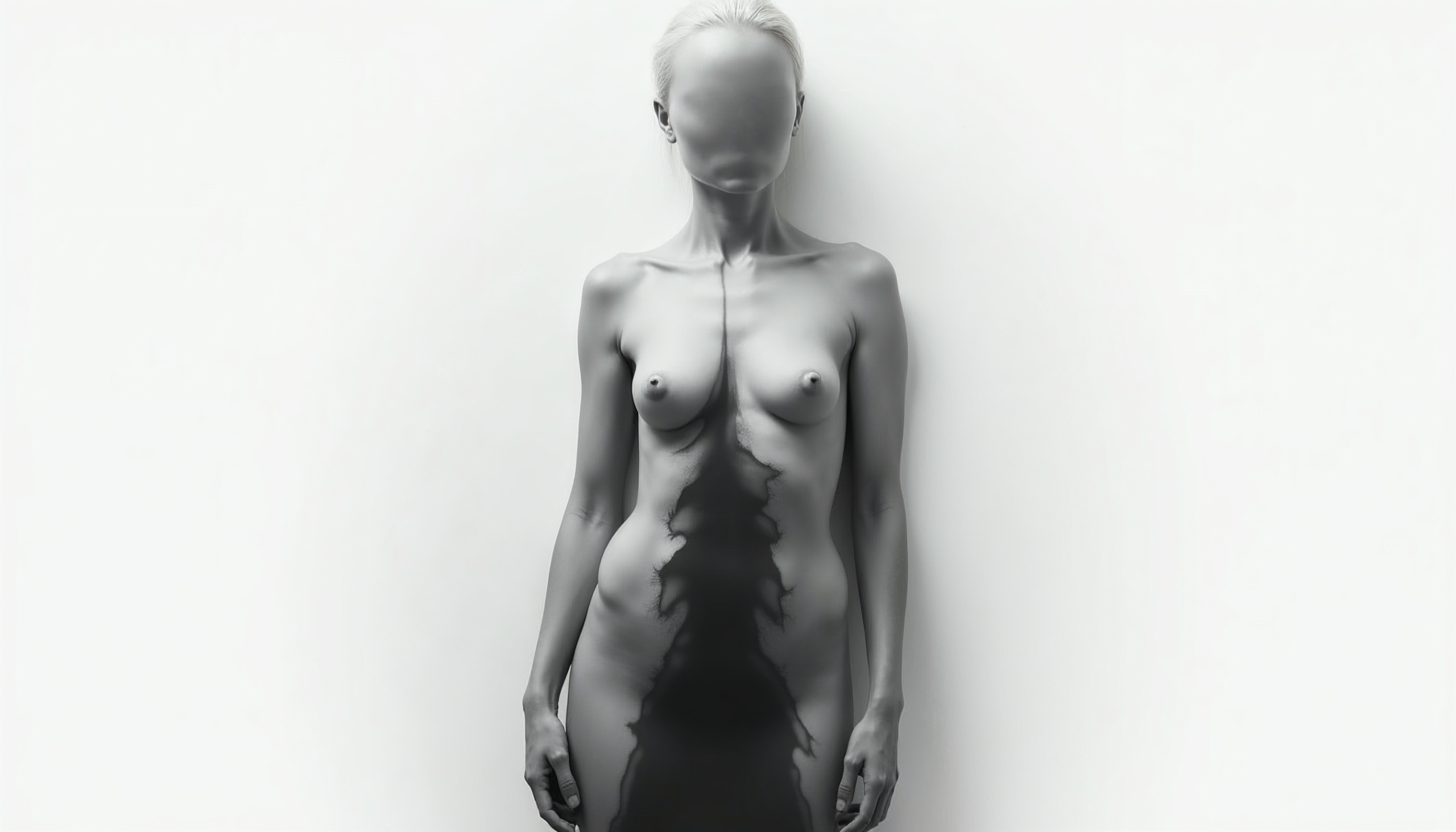
Concept: The body as hourglass, time as black sand falling through transparent skin
My Sketch: Rough figure outline, ribcage visible, sand streaming through torso
AI Prompt (refined over 30 iterations):
- Ethereal translucent human figure made of delicate glass,
- internal anatomy visible as flowing black sand pouring through
- ribcage and spine, chiaroscuro lighting, fine art photography
- aesthetic, muted earth tones, high contrast, grainy texture,
- surreal but anatomically grounded, existential mood,
- shot on medium format film, subtle imperfections,
NOT glossy, NOT digital-smooth, NOT fantasy
AI Output: 40 variations
Selected: Version 23 (haunting, vulnerable, sand feels heavy)
Photoshop Refinement:
- Added grain overlay (Kodak Tri-X film simulation)
- Darkened edges (vignette, focus inward)
- Composite: hands from version 12 (more expressive)
- Reintroduced sketched ribcage details AI softened
- Final mood: You feel the weight of time
Key Images & Their Journey
1. Cover: “Atlas of the Falling Hour”
- Concept: Hourglass as universe, time falling through cosmic body
- Process:
- Sketch: Hourglass merging with human silhouette
- AI: 60+ variations exploring glass texture, sand dynamics
- Final: Composite of 3 AI outputs + hand-drawn title integration
- Result: Immediate visual thesis—you ARE the hourglass
2. Chapter IV: “If Skin Were Fabric”
- Concept: Aged skin as sacred textile, wrinkles as pleats of time
- Process:
- Sketch: Draped fabric with visible weave, transforming into skin
- AI Prompt: “Hyperrealistic aged fabric with human skin texture emerging, extreme macro photography, visible thread wear, golden hour lighting, textile archaeology”
- Iterations: 35 (most too literal—fabric OR skin, not metamorphosis)
- Selected: Version 28 (you can’t tell where fabric ends and flesh begins)
- Result: Tactile, you want to touch it, feel the years
3. Chapter X: “The Silent Weavers”
- Concept: Invisible threads connecting fragmented selves
- Process:
- Sketch: Figure dissolving into golden threads
- AI struggled with “invisible but present”—kept making threads too obvious
- Solution: Generated solid figure, then manually erased/threaded in Photoshop
- Added: Subtle gold leaf texture overlay (handmade element)
- Result: You see the threads only if you look for them—perfect metaphor
4. Chapter XI: “Flesh Is Only Flesh”
- Concept: The brutal reality of matter vs. time
- Process:
- Darkest chapter, needed visceral weight
- AI Prompt: “Decaying organic matter transforming into black sand, memento mori aesthetic, Caravaggio lighting, not grotesque but honest, textural erosion”
- Risk: Too morbid vs. too abstract
- Selected: Version 42 (feels like witnessing, not observing)
- Result: Uncomfortable but necessary—flesh surrendering
Typography as Voice
Title Treatment:
- Hand-lettered initial sketches
- Vectorized in Illustrator
- Each chapter title = unique weight/spacing reflecting content
- “White Noise” = scattered, unstable baseline
- “I Will Repeat Myself Until I Find Me” = layered, overlapping
- Not decoration—embodied meaning
Layout Choreography
Spreads designed as durational experiences:
- Left page: Text (invitation)
- Right page: Image (response)
- Turn: Threshold crossed
- White space: Breath before next meditation
Example Spread Rhythm:
Pages 52-53: Title “I Am Black Sand” (left) + Full-bleed image (right)
Pages 54-55: White space (left) + Poem begins (right)
Pages 56-57: Poem continues (left) + Detail image (right)
Pages 58-59: Poem concludes (left) + Contemplative white space (right)
Reader forced to slow down. You can’t rush time.
TECHNICAL EXECUTION & TOOLS
AI Platforms Used
Kling AI:
- Strengths: Anatomical accuracy, realistic textures
- Used for: Body-based images (Chapter VIII, XII)
- Weakness: Too “clean”—required heavy grain addition
Venice AI:
- Strengths: Atmospheric, moody, high contrast
- Used for: Abstract conceptual images (Chapter I, III)
- Weakness: Sometimes too painterly
Freepik AI:
- Strengths: Texture generation, material studies
- Used for: Fabric/thread details (Chapter IV, V)
- Resources: Stock textures for compositing layers
Hedra AI:
- Strengths: Anatomical accuracy, realistic textures
- Used for: Body-based images (Chapter VI, X, XI)
- Weakness: Too “clean”—required heavy grain addition
Critical Realization:
No single AI platform was sufficient. Best results came from:
- Using 2-3 platforms per image concept
- Selecting strongest elements from each
- Compositing in Photoshop (5-15 layers per final image)
Photoshop Techniques
Texture Overlays:
- Scanned paper grain (Canson Mi-Teintes)
- Film grain simulations (Kodak Tri-X, Ilford HP5)
- Fabric weave textures (linen, canvas)
- Applied at 15-40% opacity for subtle analog feel
Color Grading:
- Curves adjustment: lift shadows slightly (prevent pure black)
- Selective color: desaturate except strategic gold accents
- Split toning: cool shadows, warm (but muted) highlights
- LUT: Custom “Erosion” preset (ochre/sienna bias)
Blending Modes Used:
- Multiply (for hand-drawn elements over AI base)
- Screen (for light/thread elements)
- Overlay (for texture integration)
- Luminosity (for tonal adjustments without color shift)
Hand-Drawn Re-Integration:
- Many AI outputs lost the “trembling” quality of original sketch
- Solution: Scan sketch at high-res, extract line work, overlay at 20-60% opacity
- Result: Images feel touched by human hand, not just computed
Print Production Specs
Format:
- 8.5″ × 11″ (portrait)
- Full-color interior
- Matte finish cover (not glossy—philosophical, not commercial)
File Preparation:
- Resolution: 300 DPI (all images)
- Color space: CMYK (from RGB AI outputs—careful conversion to preserve mood)
- Bleed: 0.125″ (images that bleed to edge)
- Margins: Asymmetric (inner 0.75″, outer 0.5″—breathes outward)
Amazon KDP Requirements:
- PDF export from InDesign
- Embedded fonts
- Flattened transparencies
- Total file size: 487 MB (image-heavy, required compression without quality loss)
RESULTS & IMPACT
A mobile-ready website is no longer optional — it’s a core requirement for doing business online. Whether you’re generating leads, selling products, or simply providing information, your mobile experience can make or break user trust. If your site isn’t mobile-friendly, you’re likely leaving money on the table.
Not sure where to start? Our team can help audit, redesign, or rebuild your website to be fully optimized for mobile — fast, accessible, and built for resultsrr

